In 2026, your bio link page is no longer just a list of links—it’s your most important branding tool.
Your Bio Link Isn't Just a Link Anymore—It's the First Thing People Judge You By
Here's something most people don't think about: your bio link is often the very first real interaction someone has with your brand.
Not your website. Not your product page. Your bio link.
And yet, most people treat it like a junk drawer—throw in a few URLs and call it done. That's a mistake that's quietly costing you clicks, trust, and conversions.
From Workaround to Front Door
Bio links started as a hack. Instagram gave you one link, so creators found ways to make it stretch. Simple enough.
But things have changed. That one click now carries a lot of weight. It can send someone straight to your best offer—or send them bouncing off a cluttered, confusing page that makes them question if you're worth their time.
In 2026, your bio link needs to work harder than that.
You've Got About Three Seconds
That's genuinely how long people take to decide whether they want to stay on your page or leave.
When someone clicks through, they're running a quick mental checklist—does this look legit? Do I understand what's going on here? Is there anything actually worth my time?
If your page doesn't answer three basic questions almost immediately—who you are, what you offer, and what they should do next—you've already lost them.
No harsh feelings. That's just how people work online now.
Design Does the Talking Before You Do
You don't need a flashy page. You need a clear one.
Good design on a bio link page isn't about winning aesthetic points—it's about making things obvious. A clean layout, a consistent color palette (two or three colors, tops), legible fonts, and some breathing room between elements goes a long way toward making someone feel like they're in the right place.
Every single element should earn its spot. If something isn't helping people understand what to do next, it's just clutter.
Think Flow, Not Menu
This is where most bio link pages fall apart. People list everything they've ever made or done, in no particular order, hoping something sticks.
A page that actually works feels more like a path than a bulletin board:
- Up top: Your name or logo, a one-line description of what you do, maybe a simple visual.
- In the middle: Your most important call-to-action first, then a couple of supporting links.
- At the bottom: Socials, extras, anything that doesn't need prime real estate.
That's it. You're not hiding anything—you're just being intentional about what people see first.
Pick One Goal and Commit to It
If your page is trying to sell a product, grow a YouTube channel, showcase a portfolio, and collect email signups all at once—none of those things are going to happen very well.
Pick the one thing that matters most right now. Build the page around that. Let everything else play a supporting role or get cut entirely.
It feels limiting at first. In practice, it works a lot better.
Consistency Builds Trust Quietly
People notice when something feels off—even if they can't articulate why.
If your Instagram feels one way and your bio link page feels completely different, there's a subtle disconnect that erodes confidence. Your page should feel like a natural extension of everywhere else you show up: same tone, same vibe, same visual energy.
When everything lines up, people trust you more. It's not complicated—it's just consistency doing its job.
Speed Is Non-Negotiable
A slow page in 2026 is basically a closed door.
People aren't waiting around. If your bio link page takes more than a couple of seconds to load on mobile—and most clicks are coming from mobile—they're gone. Fast, lightweight, and responsive isn't a bonus feature anymore. It's the bare minimum.
Make It Yours
Generic templates are fine as a starting point, but they also make you look like everyone else using that same template.
Small customizations matter more than people realize—a unique headline, a call-to-action that actually sounds like you, colors that match your brand, a layout that reflects how you actually present yourself. These details are what separate a page that converts from one that just exists.
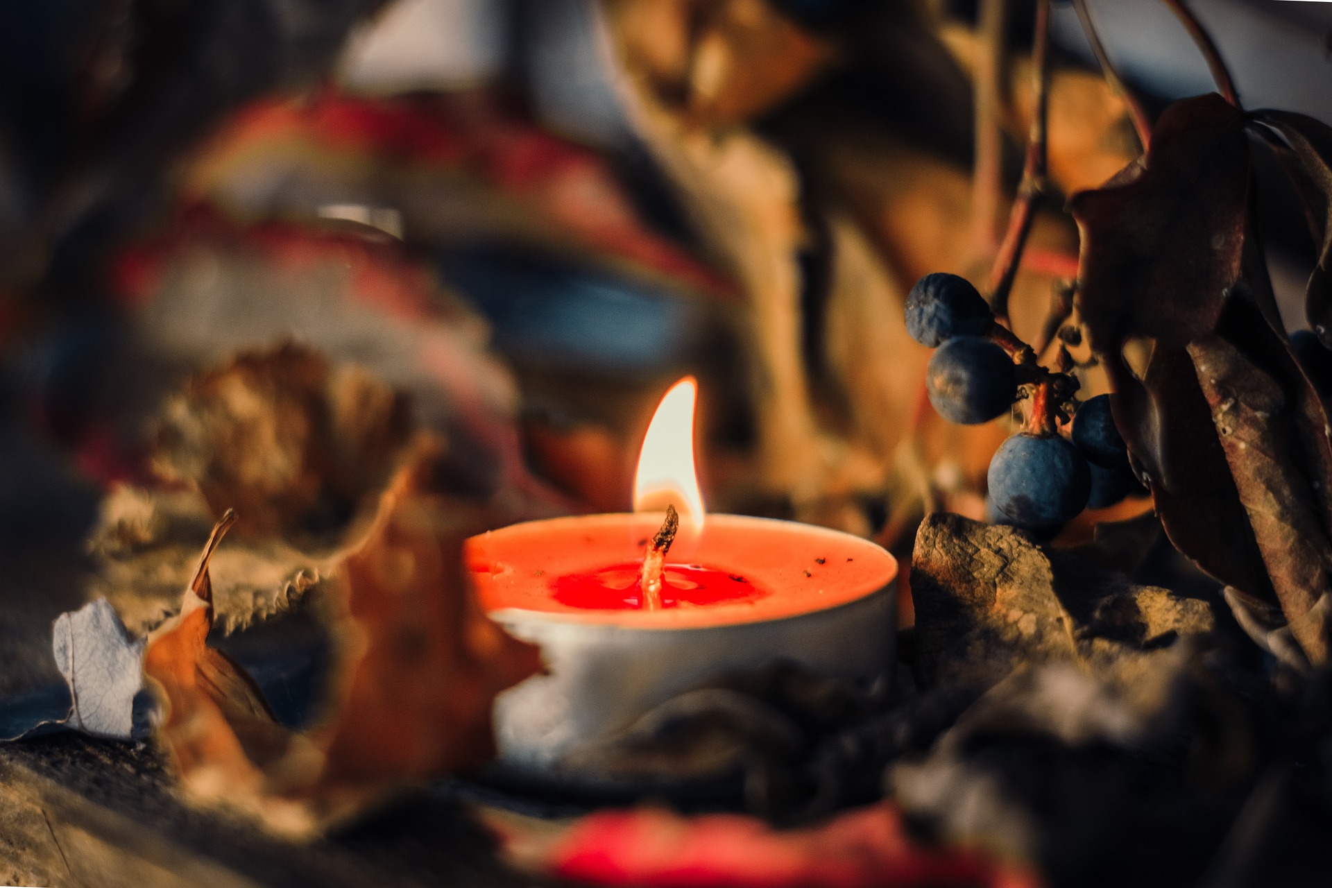
A Simple Example That Works
Say you make and sell handmade candles. Your bio link page really only needs a few things: a clear line about what you sell, a big "Shop Now" button right at the top, two or three links to your main collections or your story, and a clean warm look that loads fast on anyone's phone.
That's the whole page. No fluff. No confusion. Just exactly what someone needs to go from curious to buying.
The Bottom Line
Your bio link is an asset now—and assets either perform or they don't.
The ones that perform aren't the most elaborate or the most heavily designed. They're the ones that are simple, focused, consistent, and fast.
If yours isn't doing that work for you, it's worth taking a fresh look. Not to make it bigger—just to make it smarter.
Image by Chloé Dupré